Blogs
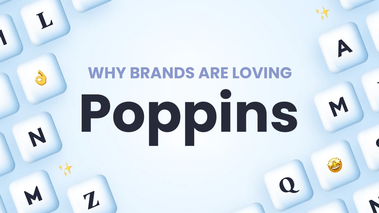
Exploring the Elegance of Poppins Typeface
In the vast world of typography, each typeface carries its own personality, influencing the tone and message of the text it adorns. Among the plethora of options available, Poppins Typeface stands out as a versatile and elegant choice. Developed by Indian Type Foundry, Poppins is a geometric sans-serif typeface that exudes modernity and sophistication.
Poppins Typeface made its debut in 2014 as part of the Google Fonts library. Its creation was driven by the need for a typeface that could convey a sense of simplicity and clarity across various platforms and applications. Designed by Ninad Kale and Jonny Pinhorn, Poppins draws inspiration from the urban landscape, with its clean lines and rounded shapes reminiscent of modern architecture.
One of the defining characteristics of Poppins is its extensive range of weights and styles, making it suitable for a wide array of design projects. From light and airy to bold and commanding, Poppins offers versatility without compromising on legibility. Its open counters and generous spacing contribute to its readability, even at smaller sizes or on low-resolution screens.
Poppins Typeface finds its place in a myriad of design contexts, from digital interfaces to print media. Its clean aesthetic makes it particularly well-suited for corporate branding, where professionalism and clarity are paramount. Additionally, Poppins adds a touch of elegance to editorial layouts, signage, and advertising campaigns.
Poppins Typeface's versatility extends beyond its weight variations. Its clean geometric forms make it adaptable to both serious and playful aesthetics, allowing designers to experiment with tone and mood. Whether used for body text or headlines, Poppins maintains its elegance and readability across different mediums and applications.
In an age where digital communication reigns supreme, accessibility is a crucial consideration in typeface selection. Poppins excels in this aspect, thanks to its clear letterforms and balanced proportions. Its legibility remains uncompromised across screens of varying resolutions, ensuring that the message comes across loud and clear, regardless of the platform.
While Poppins Typeface draws inspiration from urban landscapes, its appeal transcends geographical boundaries. Its clean and modern aesthetic resonates with audiences worldwide, making it a popular choice among designers from diverse cultural backgrounds. Whether used in English, Hindi, or any other language, Poppins adapts seamlessly, maintaining its elegance and readability across different scripts.
Poppins Typeface stands as a testament to the power of typographic design in shaping visual communication. With its clean lines, extensive weight options, and global appeal, Poppins offers designers a versatile tool to convey their message with elegance and clarity. Whether gracing a digital interface or adorning a printed page, Poppins leaves a lasting impression, making it a timeless addition to any designer's toolkit.
Allother author's recent blogs
- • Why Stainless Steel Water Flasks Are a Must-Have for Outdoor Adventures
- • Embracing Rustic Charm: The Cottagecore Tote
- • From Blueprint to Reality: Modern House Designs with 2D-3D Plans for Single-Stor
- • Illuminate Your Style: Discover the Unmatched Glamour of Our Diamond Bracelets
- • Het Ajax Alarmsysteem: Eenvoudig te Installeren en Programmeren
- • The Benefits of Business Trip Massages for Maintaining Well-Being and Productivi